Newcastle · online shop build
Silas Ingles Art
Sixteen years of painting, prints and photography, and no site of his own to show it on.
The situation
What they were working with.
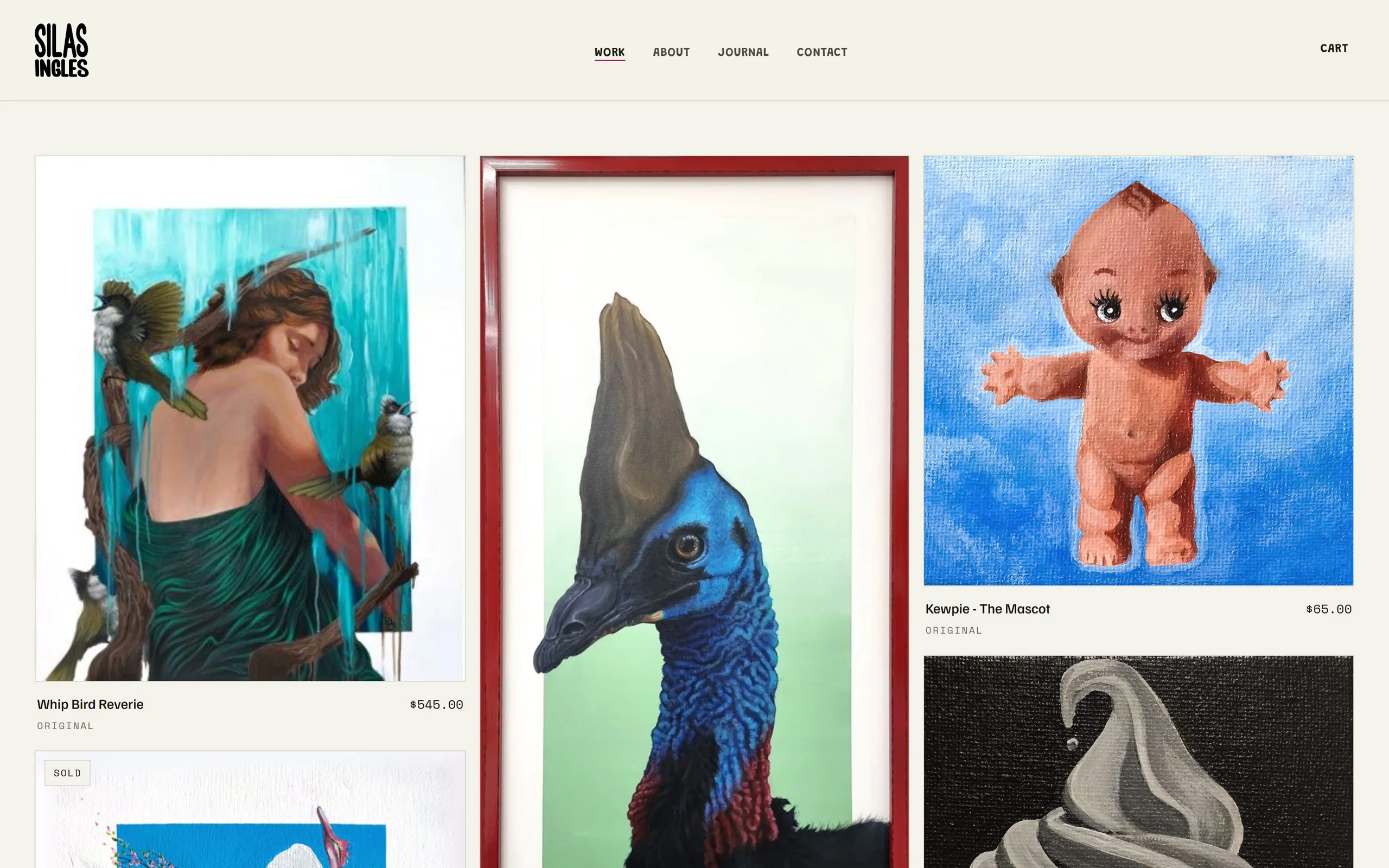
Silas is a Newcastle artist, sixteen years deep across painting, prints, stickers, photography and graphic design, working on his own. The work existed. A place of his own to show and sell it did not: no site, no shop, and a domain still to be registered.
He was clear about who it is for. Alternative and queer folk, fellow creatives, and collectors. Everyone welcome, but the tone set by that core. He was just as clear about the job: someone arriving from a search or an Instagram link should see the work immediately, find what a piece costs and whether it is still available, and either buy it or email him about a commission.
His hard rules were accessibility, high contrast and large type, and no AI-generated imagery anywhere. Only his actual art, ever. What he did not want was anything that reads as uniform or templated.
The decisions
Five calls, and why we made them.
- 01
The gallery is the front door
That is his phrase, and it decides the structure. The home page is the gallery and the shop at once, in a tight packed masonry that runs to five columns on a wide screen. Every tile is the whole image at its natural ratio. Nothing is cropped square, nothing gets sliced across a column break. Each piece carries its title, its type, and either a price or its status.
- 02
The product page never crops the art
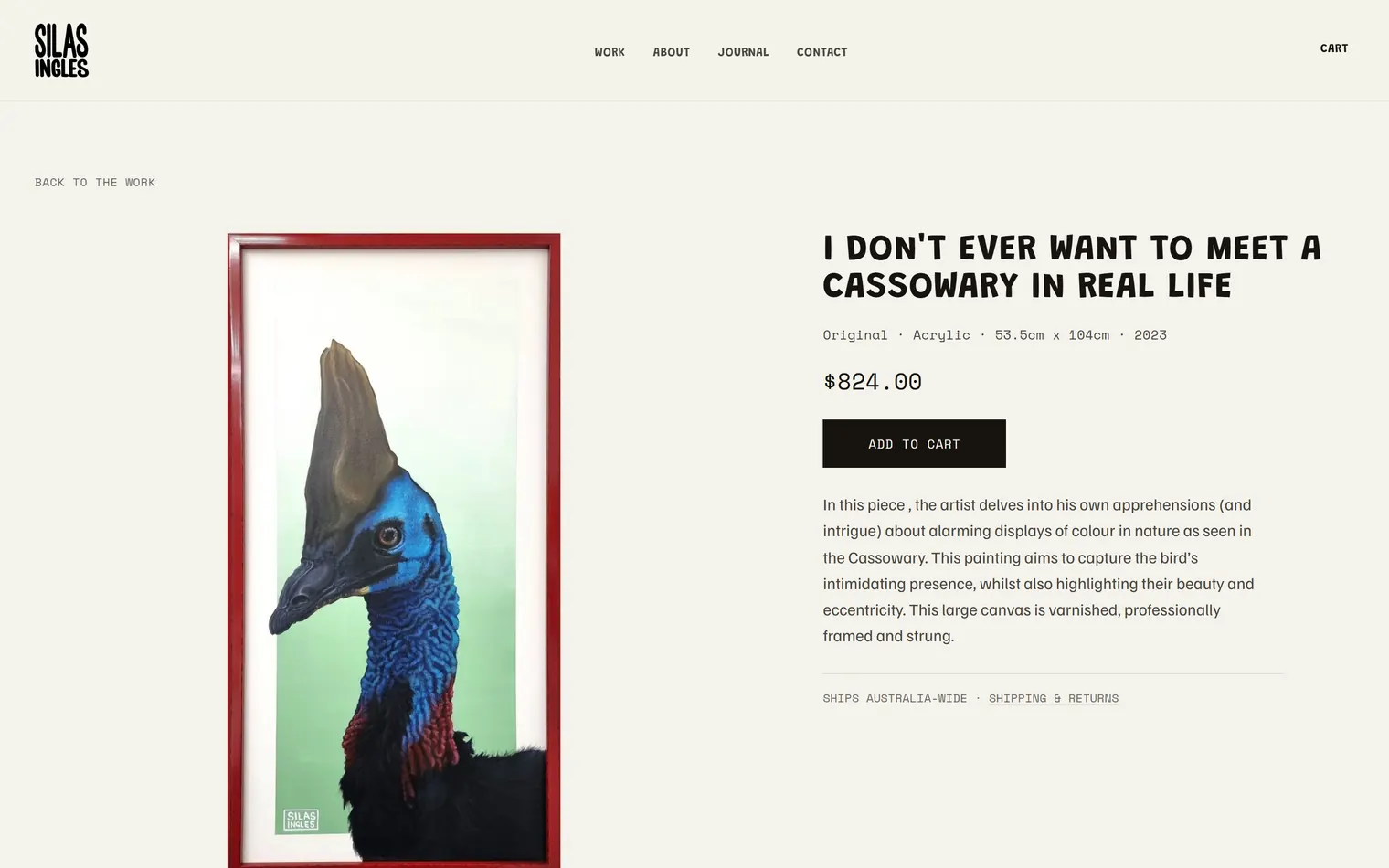
The first version framed every piece in a fixed 4:5 window and cropped to fill it. That is fine for a shop and wrong for a painting, so it came out. The frame now shrink-wraps the image at whatever shape the work actually is, with a height cap so a tall canvas like the 53.5 by 104cm cassowary still lands on one screen.
- 03
No contact form
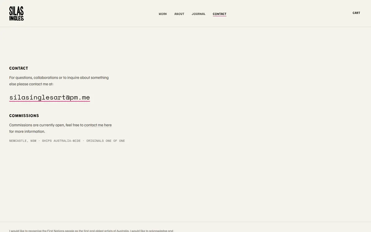
A commission is a conversation between two people, and a form with required fields is the wrong opening move. Contact is an email address and a line about which commissions are open. Briefs and reference photos arrive as a reply.
- 04
Uploads shrink on the way in
He did not want print-quality files of his paintings sitting on a public server. The CMS downscales every upload to a 1200px web copy as it saves, so what the site serves is a web image and not a print master.
- 05
Writes are locked to two named accounts
The obvious setting on a database like this is to let any authenticated user write, which would mean anyone who signed up could edit the gallery. The policies are pinned to two specific owner addresses instead, so a stranger who creates an account gets exactly nothing.
The scope
What is actually in it.
Pages
- Gallery, which is also the shop
- A page for every piece
- About
- Journal
- Contact and commissions
- Shipping and returns
The machinery
- A CMS he runs himself
- A private admin page where he adds pieces and journal posts, sets a price, and moves a piece between available, reserved and sold. No developer in the loop.
- Stripe checkout
- Two server functions do the work. One re-prices the cart from the database and refuses anything sold, unpublished or unpriced, so a one-of-one cannot be bought twice. The other verifies Stripe's signature, records the order, and flips the piece to sold. A piece with no price stays on Enquire, so he can price them one at a time.
- Australia-only shipping
- Enforced inside the checkout function, not just written on a page.
- A mailing list
- A signup that writes to his own database, so the audience belongs to him.
- A fallback for a bad day
- Every public page reads from the CMS and falls back to markup already in the page if that request fails. A database wobble costs him a fresh update, not his gallery.
The screens
Where the work goes.
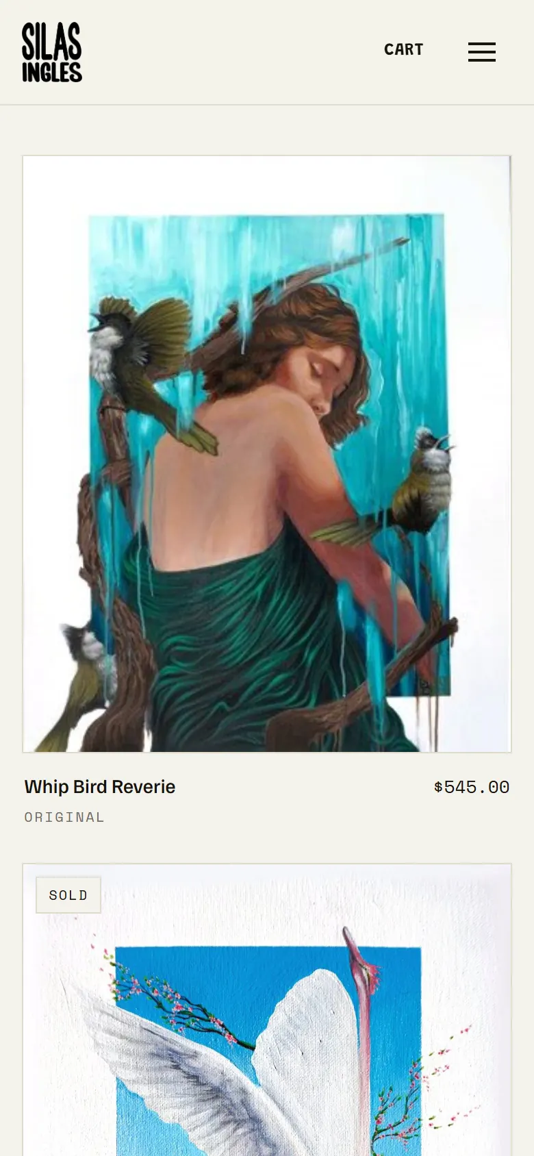
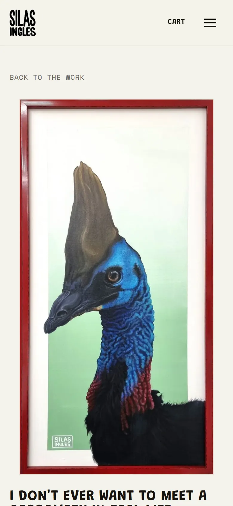
Up close
Small things, on purpose.
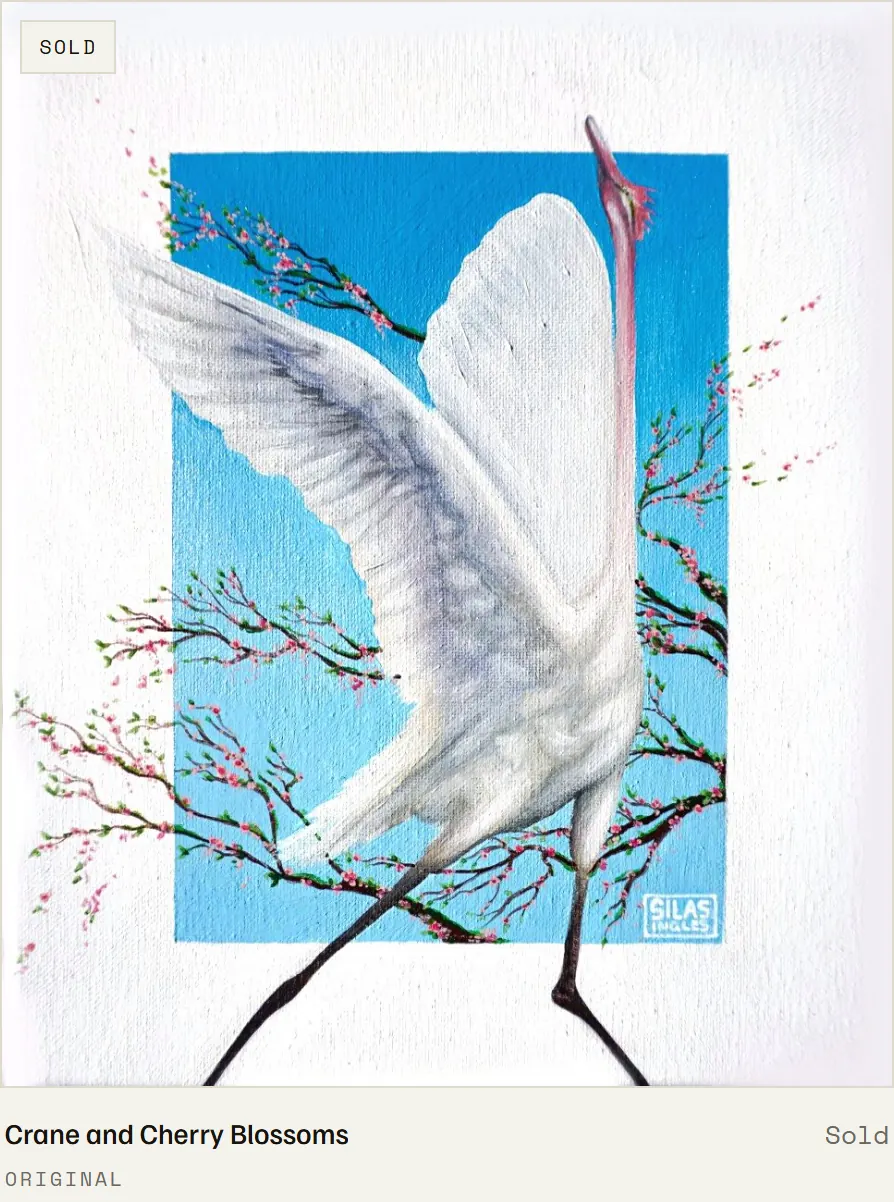
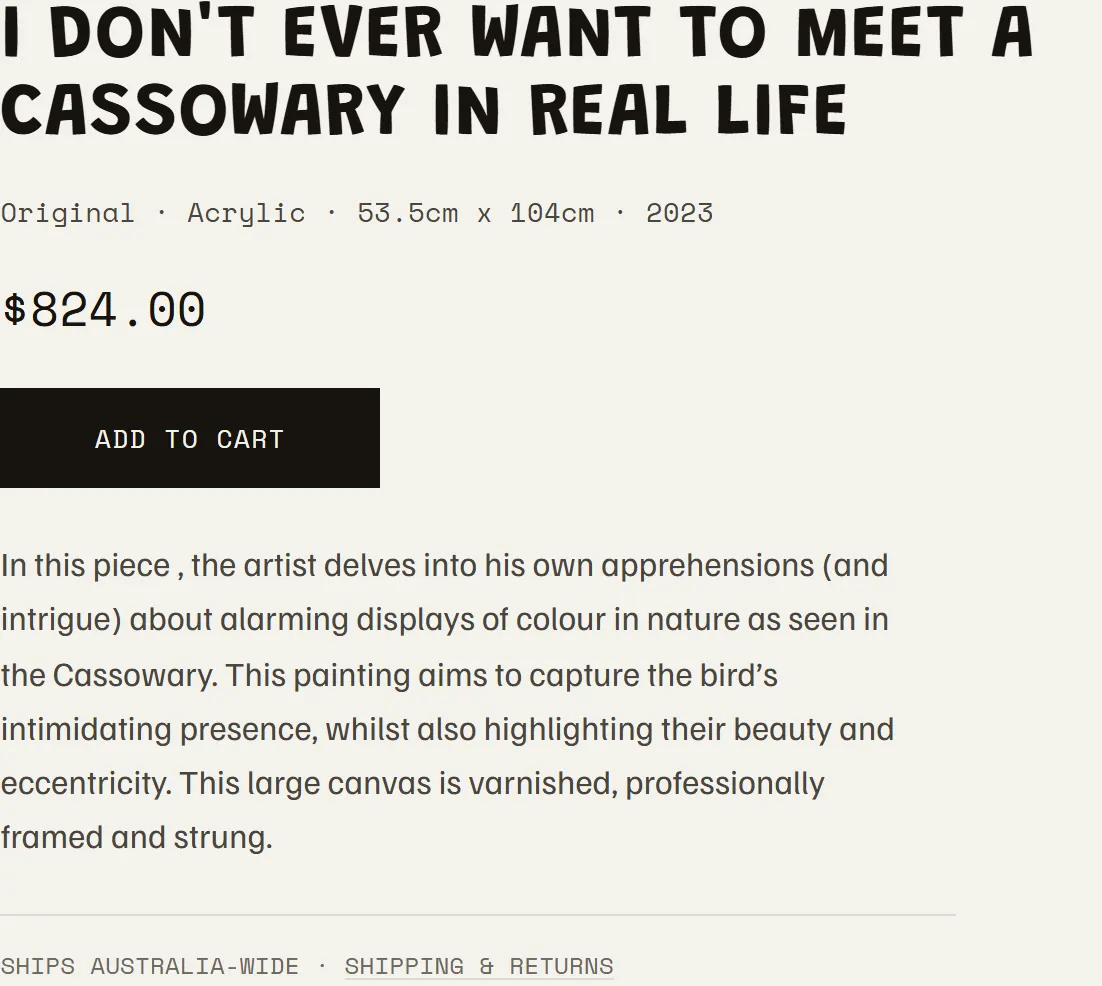
All of it is running right now. Click through and use Silas Ingles Art the way a customer would.
Visit the live site(opens in a new tab)Next build
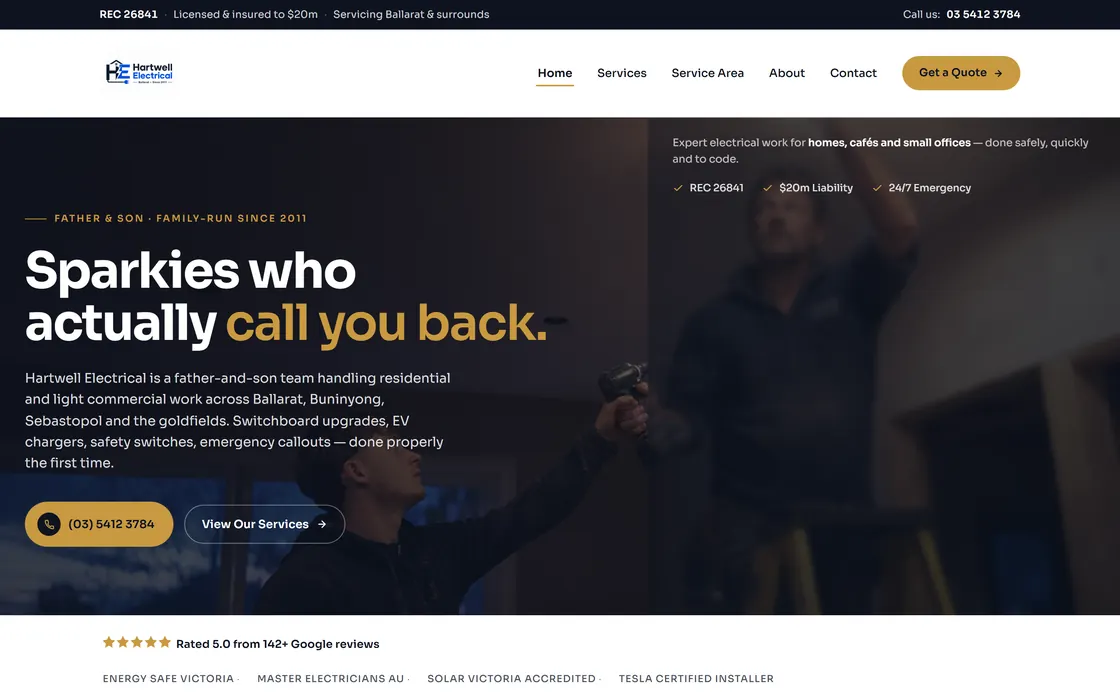
Hartwell Electrical
Licence, coverage and phone number, answered before anyone has to scroll.
Yours gets exactly the same treatment.
Talk to us